In the visual circus that has become the retail environment, the icon can be your most effective tool for communicating your brand s message and for connecting with your consumers.
It s a proven fact: Graphics are far more effective than words. Behavioral psychologists and communications researchers have determined that humans perceive our world in a very specific hierarchy. Regardless of our age, education, nationality or cultural background, we see, respond to and remember graphics far more consistently and accurately than we perceive words. Prove it to yourself. In your next qualitative study, before you ask consumers anything about your brand or retail environment, ask them to draw a picture of it, unalded. Research indicates that consumers will remember colors first, graphles second, numbers third and words last.
What does all this mean to your brands identity at retail? Take a page from Kodaks new brand communication strategy: Our design firm, Wallace Church, recently completed the integrated redesign of Kodak s consumer imaging category, which comprises film, one-time-use cameras and specialty products. This category represents more than 50 SKUs and up to 17 linear feet at retail.
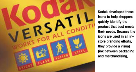
Each of Kodaks products has a specific "best use." Rather than using words to communicate each products unique benefit, as with the previous communications strategy, Wallace Church recommended that these "best use" messages be visually communicated in graphic icon forID. Not only did this strategy better differentiate products by their ideal uses; it also developed a good/better/best perception within the product line. Those products with few icons were perceived by consumers as "good, "those with more icons were perceived as better" and those with the most icons were perceived as the most versatile and, therefore, the "best." This strategy drove consumers up the value chain and into Kodaks higher-priced offerings. As a result, both sales and margins increased.
Icons also provide an essential visual link between packaging, merchandising and all other point-of-sale communications. In Kodaks case, icons were consistently used in all in store-branding efforts. This integrated visual message results in an impactful, understandable and effective "shopability system," which quickly leads consumers to the product that best meets their needs.
Icons have always been with us, but with computers rapidly taking over as our primruy mode of information gathering, icons continue to prove themselves as the "killer visual app." Imagine how difficult it would be to navigate Windows, Excel or the Web if all your commands were in text.
As your brand reaches out to ethnic audiences and expands into global markets, icons again prove to be critical. They transcend all languages, thereby minimizing copy and maintaining a clean, uncluttered, premium look - even for multinational communications that require three and four languages.
When used consistently, icons can also quickly become proprietary mnemonics for the brand. In Kodaks case, the icons become ownable symbols for the brand and eventually will join the yellow background color and red logo as one of the brands primary visual equities.
In short, icons are fast becoming the visual language in which your brand must become proficient. Stretching the Kodak analogy a bit, icons become the pictures that are worth a thousand words of your brands message.
Rob Wallace, is managing partner of Wallace Church Inc., a Manhattan-based strategic brand identity consultancy with clients including P&G / Gillette, Nestlé, Coca-Cola, Schering-Plough, Kodak, Brown-Forman, Heinz and Kraft.
©Copyright - All Rights Reserved
DO NOT REPRODUCE WITHOUT WRITTEN PERMISSION BY AUTHOR.