Brand extensions are more than twice as likely to succeed as new brands. With mega-brands like Crest extending to more than 80 SKUs in the United States alone and over 300 products worldwide, today's brands are not just expanding-they are hyper-proliferating.
Brand identity architectures-and the design strategies that define them-are rarely planned to accommodate this hyperbolic explosion. In an effort to differentiate their various tiers, firms may use design strategies that overstep their needs. In the best cases, these ill-planned design architectures close the door on future brand growth. In the worst cases, over-extended design architectures actually denigrate the base brand's integrity.
The most successful brands leverage their relevance across a number of meaningful experiences, attracting a broad range of consumer profiles without eroding the brand's essence. In their initial evolution, brands offer core users variations of the same experience. As they grow, many brands offer core consumers completely new, but relevant experiences. When they are more fully evolved, idealized brands leverage their core attributes to both new consumers and new experiences. And when a brand's values become so richly engrained in the culture, the brand's reputation can credibly endorse unrelated brands, too, while still building on base-brand credibility.
Certainly not all brands are relevant enough, nor all brand experiences rich enough, to extend to all tiers. Regardless, all ideal brand identity architectures effectively differentiate each brand offering while actually building on the brand's integrity. In this article, we'll show how it's done by using two examples: the first is Lean Cuisine, an actual, established brand of frozen entrees, and Sunshine Grove, a fictional brand of orange juice created for illustrative purposes.
Hierarchy of design strategies: colors, shapes, numbers, words
Audiences typically respond to a specific hierarchy of communication. In this hierarchy, visual language is far more eloquent than verbal communication. In visual communication, color is first element observed, generating the most immediate visceral and emotional response. Successful design architecture's single most effective strategy is to establish a distinctive color relevant to the brand experience and use that color consistently. Changing brand color should only be reserved for the highest level of differentiation.

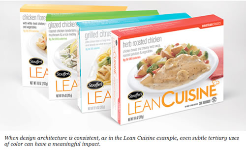
Well-planned design architectures might use color in a number of primary, secondary and even tertiary strategies. For example, the white color is Lean Cuisine's core brand mnemonic used consistently across all products, while the very subtle use of supportive colors effectively segments the brand tiers.
Shape is the second most recognized visual strategy. Again, shape can be part of the primary (i.e., package structure), secondary (layout of graphic elements) and tertiary strategies (brand logos or icons). Using the Lean Cuisine example, the layout of elements remains identical across more than 100 SKUs. Each element is in exactly the same "staging area," resulting in a recognizable brand shape that helps consumers navigate quickly. The package structure or layout shape only changes to differentiate very unique brand offerings.
Numbers are the third most immediately recognized strategy. Numbers are most effective for differentiating good/better/best brand tiers. For instance, most consumers recognize the value differences between 200-, 500- and 700-series automobiles.
.
Words are the last to be recognized and the least visceral of all cues, and therefore should not be relied on to create meaningful differentiation across the brand. As in Lean Cuisine's case, brand segment names, such as Everyday Favorites and Café Classics, are relatively small, allowing the distinctive color bands that wrap them to signal each tier more effectively.
Putting best practice to use
What follows is an outline of sequential best practices for building optimized brand identity architectures. Ten possible tiers are defined both by the criteria used to determine their place in the brand hierarchy and by some of the design strategies used to best achieve their balanced, branded differentiation.
Lean Cuisine and Stouffer's (both owned by Nestlé), as well as our fictional Sunshine Grove brand of juices, are referred to as mentors. Note that they are used exclusively to exemplify branding strategy. These examples may not be actual products nor do they indicate Nestlé's desires to extend their brands. They are used as hypothetical examples, purely to illustrate each tier of a balanced brand architecture.
. . .Continue to read rest of article (PDF).


