That "heritage" is also inherently "old fashioned" or "outdated" is a common misperception. Like any other brand left unmonitored, a heritage brand�s identity can quickly become dusty. However, with proper care, vintage brands can be recast to address a current and relevant message while still leveraging their recognized consumer connection.
The value of being the genuine original cannot be overstated. Behaviorists like Malcolm Gladwell and Barry Schwartz recognize that in a sea of newness, we consumers find comfort in brands that are consistent, honest and real. We immediately recognize their familiar identities and emotionally tie them to comfortable no-risk, well-anticipated experiences.
Joe Pine, co-author of "The Experience Economy," believes that a marketer�s ultimate goal is to transform consumers through a brand experience that they believe to be authentic � not manufactured or contrived. These brand identities certainly evolve over time but they always stay true to their essence. Brands like Arm & Hammer, John Deere, Levi�s and Jack Daniels have always known this. At Wallace Church, we call these products "icon brands."
Heinz ketchup is the very model of an �icon brand.� There is no denying that Heinz is the undisputed world-champion of the ketchup experience.
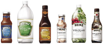
Beyond ketchup, however, Heinz markets dozens of products in numerous categories that also live under its icon. At face value, these products have little in common. They range broadly from traditional and specialty vinegars to cocktail and Worchester sauces and dozens of pickle and relish products.
In early 2005, all 30-plus products were loosely tied together using variations of the Heinz logo and "keystone" label shape. They were never promoted as a family of products, never structured to encourage cross-brand sales, and never unified under "icon brand" status. Our charge was to elevate these incongruent products into a unified and relevant "icon brand."
In the first step of this process, we defined the Heinz brand experience as "Tried and True." This perception became the emotional and experiential rallying cry that catalyzed the entire brand communications architecture.
To streamline design development, we used what we call the "Visual Brand Essence" process (or ViBE) to pre-qualify the most effective visual strategies before initiating design. Other "Tried and True" brands were visually deconstructed. Colors, typestyles, graphic cues, product presentations, iconography and all design strategies were analyzed for their potential impact on the unique Heinz heritage message.
Two visual strategies emerged as most effective. The first, labeled "Turn of the Century Americana," used graphic conventions of late 19th century design. A second strategy, termed "Old as New," effectively married late 19th century conventions with early 21st century sensibilities. These visual strategies were then researched, generating team consensus of the most effective approach.
The design exploration focused on leveraging and consistently highlighting the Heinz logo and signature "keystone" label shape. Each new design architecture explored enhancements to these equities. Concepts ranged from nostalgic Americana to more contemporary interpretations of traditional cues. Design systems were then applied to three core SKUs, thereby addressing the greatest adaptation challenges.
Several of the most effective concepts were refined and then adapted across the extensive product line. Life-sized shelf simulations were developed, indicating how each design system would appear in differing retail sections. Again, market research was conducted to confirm the one most effective design architecture.
The selected brand identity is unmistakably Heinz. Adjustments to the Heinz logo created more impact and readability. A consistent and prominent use of the signature "keystone" shape is now an icon of recognition. A consistent product illustration style recaptures the heritage perceptions. All form and flavor description and supportive copy are featured in the same "staging areas", allowing consumers to more readily find their specific product. Visual consistency in all these core areas allows background colors to change, reflecting each product�s individual benefits. For example, traditional vinegar uses a white background as a meaningful differentiation from the specialty vinegar�s richer, darker, more premium color cues.
The resulting identity balances brand�wide consistency with individual product distinction. More importantly, by recasting its authentic heritage in a richly meaningful way, the brand reclaims its place in consumers� hearts and minds. It gives the brand more credibility, more authority and a higher value. Now in the early phases of sell-in at retail, initial sales indicate increases across the entire product line.
"Icon brand" status is not manufactured, but earned over time. For brands that have earned this trust, the single most powerful marketing tool is an identity that successfully synthesizes authenticity and relevance. When done well, this process will not only elevate a brand to "icon" status, it will also convert consumers into long-term, fiercely loyal brand advocates.


